Moving Gradient Animation with CSS 🎨
20 Apr, 2021 • 1 min read
How to create smooth, animated gradient backgrounds using pure CSS, with code examples you can copy.
Listen
Playback speed
Simple animations can bring a huge difference to your websites.
For another small CSS-only effect on this site, see page fade-in animation with CSS.
Let's build something simple and unique.
Complete page background animation with CSS moving gradient
See the Pen https://codepen.io/souravdey777/pen/poROYza by Sourav Dey (@souravdey777) on CodePen.
The above Codepen example shows a moving gradient animation on the whole body of the website.
Code snippet for the animation effect.
HTML 👇
html
<body>
  <h1>
     Animation effect on "body"
  </h1>
</body>
CSS 👇
css
body {
  background: -webkit-linear-gradient(
    -70deg,
    #a2facf,
    #64acff
  );
  background-size: 400% 400%;
  animation: gradient 5s ease infinite;
}

@keyframes gradient {
  0% {
    background-position: 0% 50%;
  }
  50% {
    background-position: 100% 50%;
  }
  100% {
    background-position: 0% 50%;
  }
}
So, What is happening ??
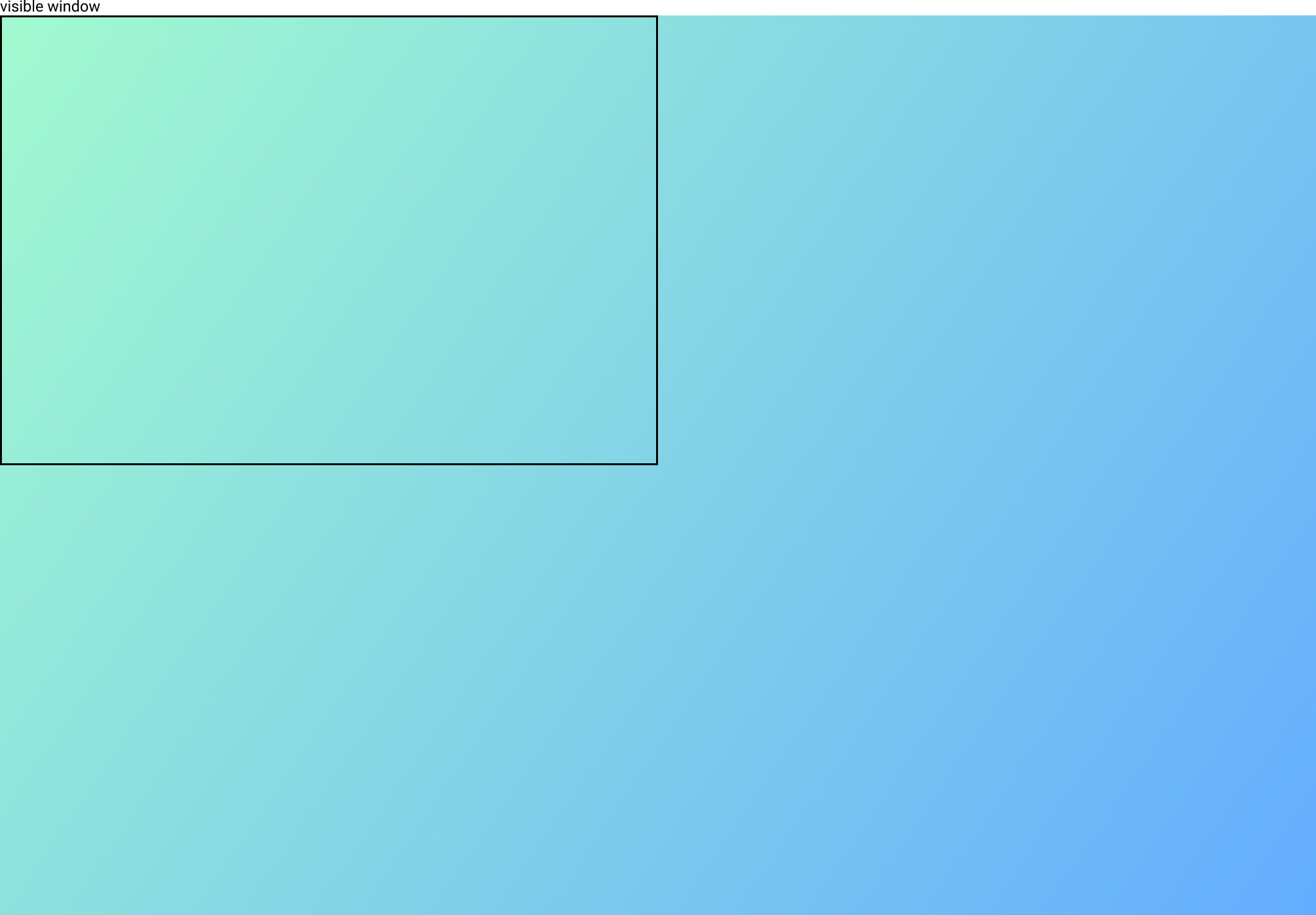
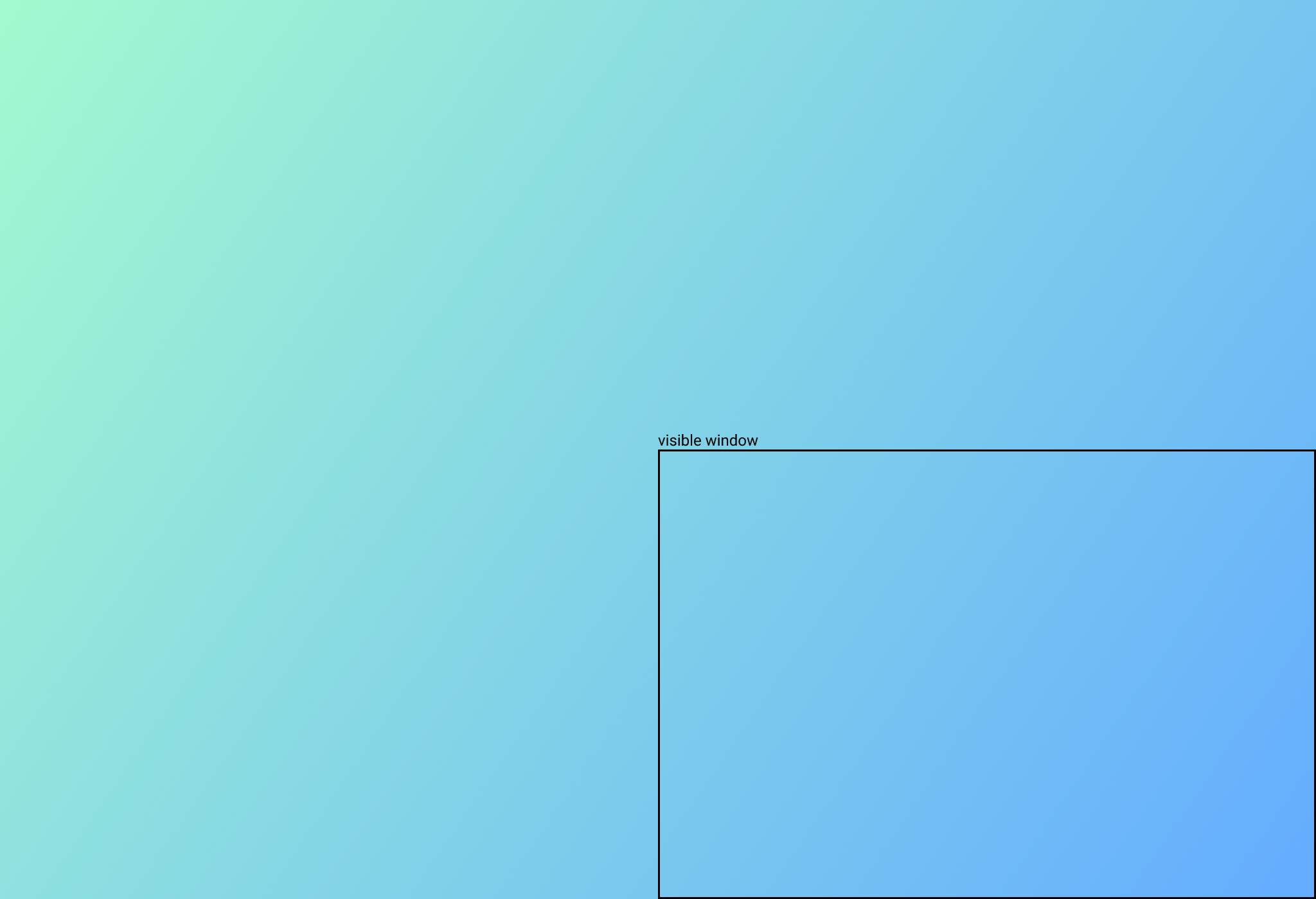
The ** background size here is 400% 400%** and the background is moving. Thus, the animation is happening.


A lot of cool stuff can be coded with this type of animation.
1. 🌈 Rainbow Effect
See the Pen https://codepen.io/souravdey777/pen/JjEmYRQ by Sourav Dey (@souravdey777) on CodePen.
The above Codepen example shows a 🌈 rainbow effect.
This is similar to the animation that we saw in the previous example but with 7 colors.
2. Loader for cards and simple components.
See the Pen https://codepen.io/souravdey777/pen/dyNgYZY by Sourav Dey (@souravdey777) on CodePen.
The above Codepen example shows a loader 🐌 with the same gradient animation.
3. Implementing the same effect on a button or cards
See the Pen https://codepen.io/souravdey777/pen/WNRaGMB by Sourav Dey (@souravdey777) on CodePen.
The above Codepen example shows 🌈 the rainbow effect on a button.
4. On Hover the same animation effect
See the Pen https://codepen.io/souravdey777/pen/ExZdNav by Sourav Dey (@souravdey777) on CodePen.
Animation on hovering on the card
Configurable parameters
- Changing the
background-size - Changing the
time-duration - Changing the
degreeof the linear gradient.
Now, put on your creative 🤠 hats and make an interesting animation effect with moving gradients.
Drop the website link in the comments for which you would be doing it or have done it.
Show your love by Sharing the blog. 🤗